


Image Comics Facsimile Fever Part 1
July 2025
This week features facsimile galore from Image Comics. Celebrate anniversaries and media releases with some of their biggest first issues.
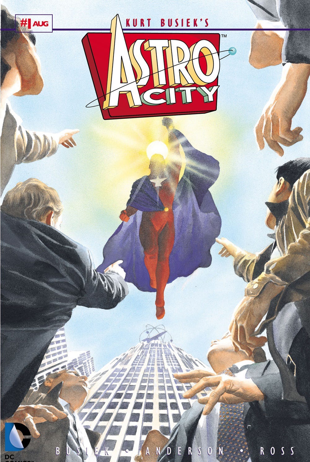
Astro City #1
(W) Kurt Busiek (A) Brent Anderson (C) Steve Buccellato & Electric Crayon (L) Richard Starkings & Comicraft
Celebrating the 30th Anniversary of ASTRO CITY, this facsimile edition reprints the first issue of the classic series from superstars KURT BUSIEK, BRENT ANDERSON, and ALEX ROSS! There's very little rest in a day for Samaritan, who must juggle a secret identity, a day job and his duties as a hero in "In Dreams." Appearances by Quarrel, Cleopatra, Black Rapier, N-Forcer, M.P.H., Beautie, Living Nightmare.
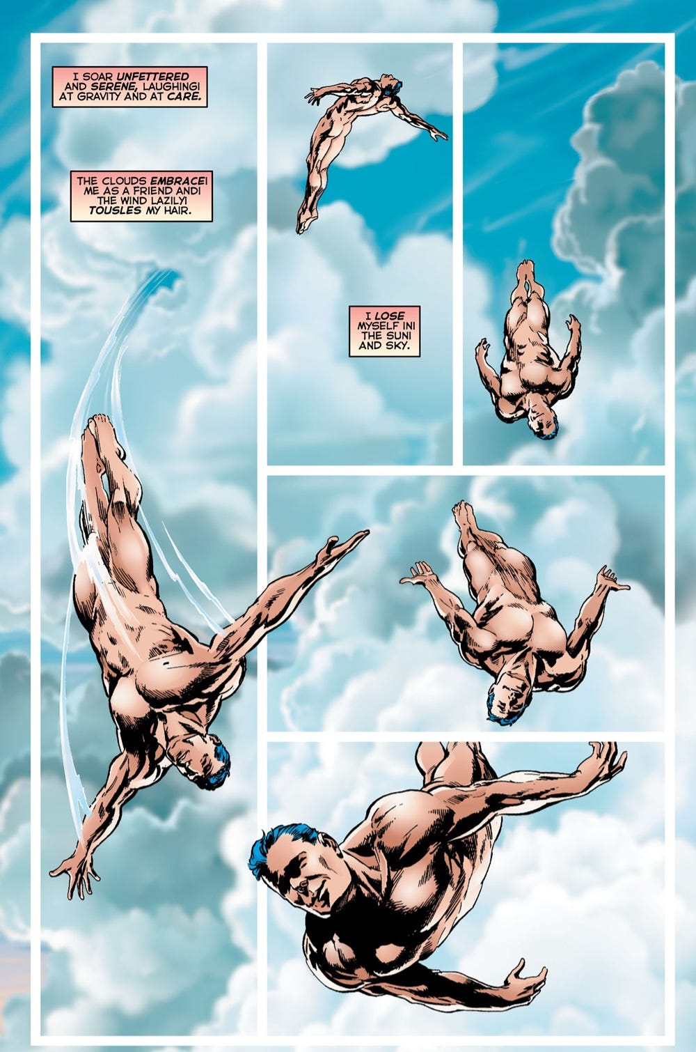
Astro City #1’s somewhat romanticized world of heroes is the perfect setting for the Superman pastiche that is Samaritan. Despite centering the story on how Samaritan makes time in his day to be a hero, Busiek successfully turns this into a more human tale. It’s helped along by a bookend dream sequence that recenters the character.
Anderson’s art is detailed throughout, but most successful is his depiction of Samaritan. Anderson uses different techniques to highlight emotion on Samaritan’s face, sometimes shading with more subtle lines around features and other times using fields on black for wider shading and shadow. Astro City #1 is a classic and worth a look by all comic book readers.
Descender #1
(W) Jeff Lemire (A & C) Dustin Nguyen (L) Steve Wands
Celebrating the 10th Anniversary of DESCENDER, this facsimile edition reprints the first issue of this beloved science fiction odyssey! One young robot's struggle to stay alive in a universe where all androids have been outlawed and bounty hunters lurk on every planet. A rip-roaring and heart-felt cosmic odyssey that pits humanity against machine, and world against world, to create a sprawling space opera from the creators of Trillium, Sweet Tooth, and Little Gotham.
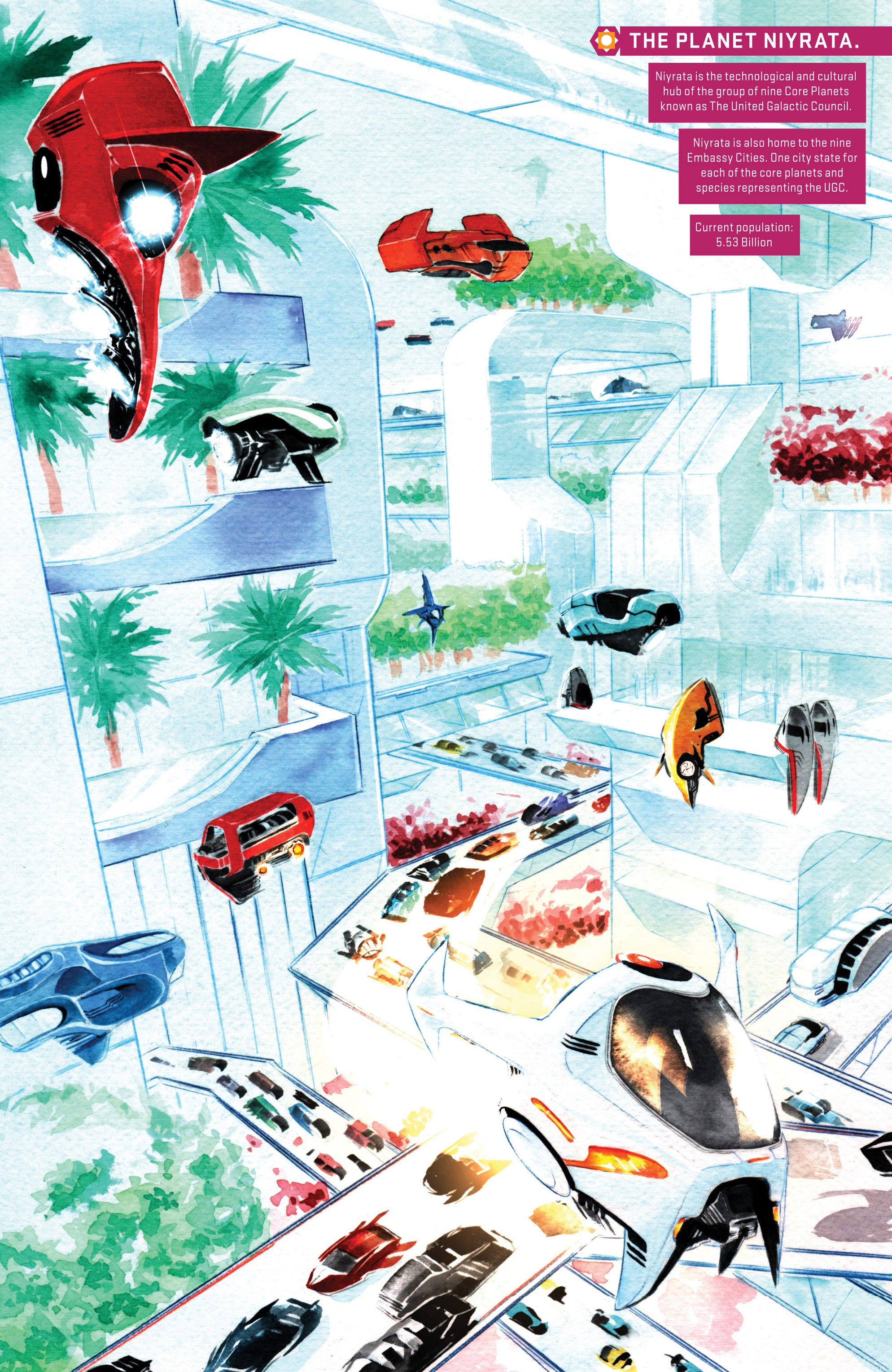
Descender #1 makes a statement from the first page with its stunning art. Nguyen’s work is precise in its detail and stunning in its painted coloring. The end result is a rich world, full of depth and emotion. Nguyen’s art works exceptionally well with characters, and the greatest beneficiary of that is the robot child companion, Tim. This critical character is overflowing with emotion and is sympathetic immediately even as he’s revealed to be a robot inside an effectively removable human looking shell.
The story opens as a grand sci-fi epic before quickly diminishing to a more intimate affair. Consistent with the epic scale, Lemire has done considerable world building. Much of it is only hinted at here with bits of dialogue, but it implies a wide, complex setting in which the story takes place. There is also a major mystery component at the heart of the story Descender #1 is setting up. This book is a must have for sci-fi fans–especially those who love beautiful visuals.
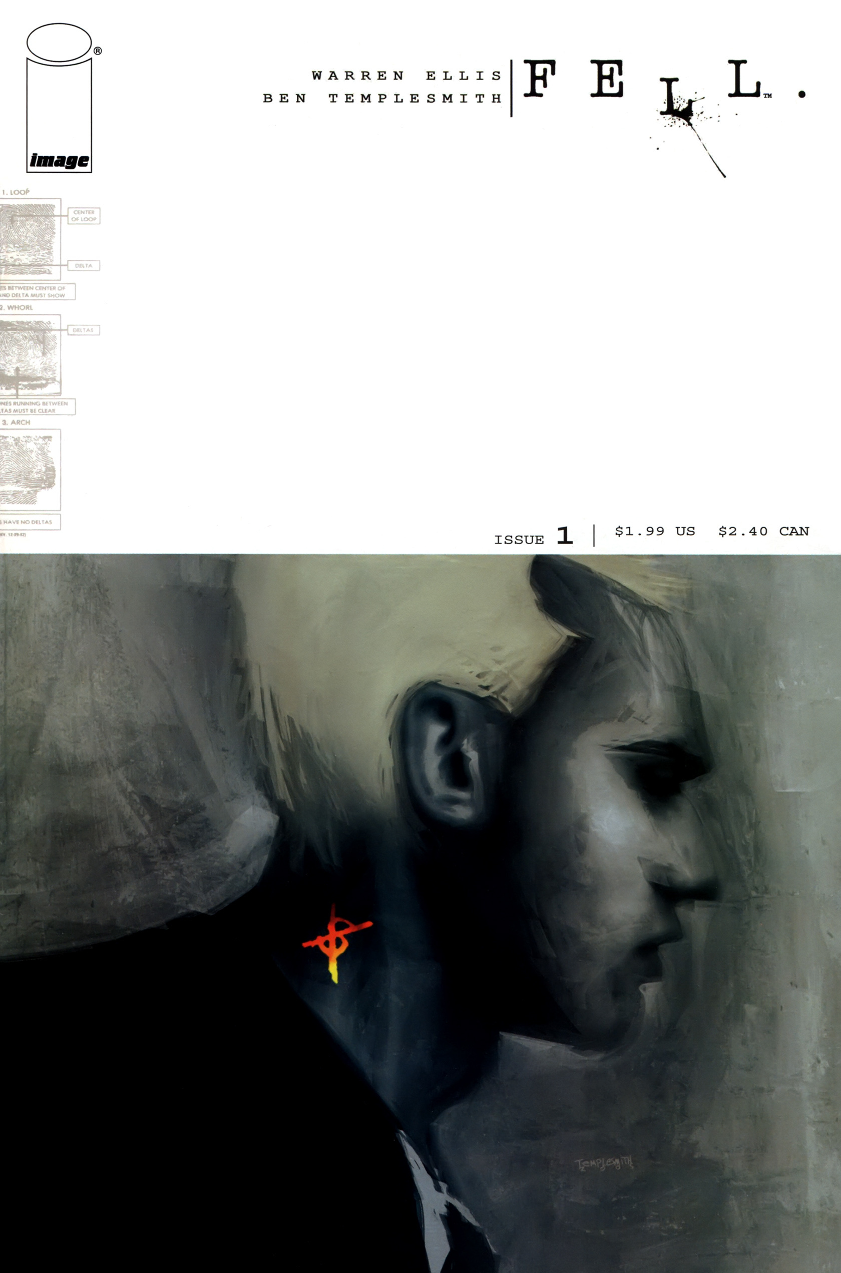
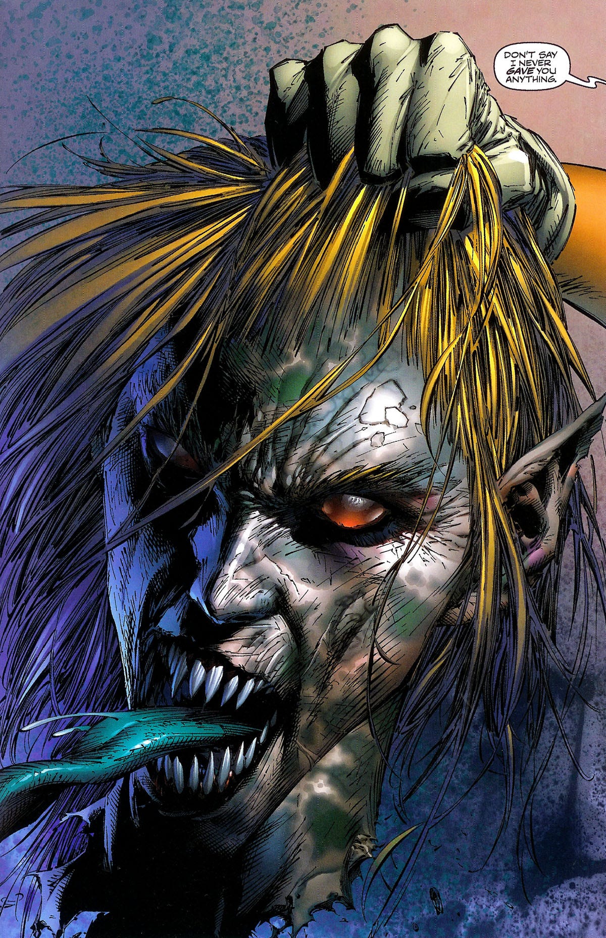
Fell #1
(W) Warren Ellis (A & C) Ben Templesmith (L) Chris Eliopoulos
Celebrating the 20th Anniversary of FELL, this facsimile edition reprints the first issue of this neo-noir classic! Detective Richard Fell is transferred over the bridge from the big city to Snowtown, a feral district whose police roster numbers three-and-a-half people (one detective has no legs). Dumped in this collapsing urban trashzone, Richard Fell is starting all over again. In a place where nothing seems to make any sense, Fell clings to the one thing he knows to be true: Everybody's hiding something. Even him. FELL is a series about murder, love, strangeness and what people hide.
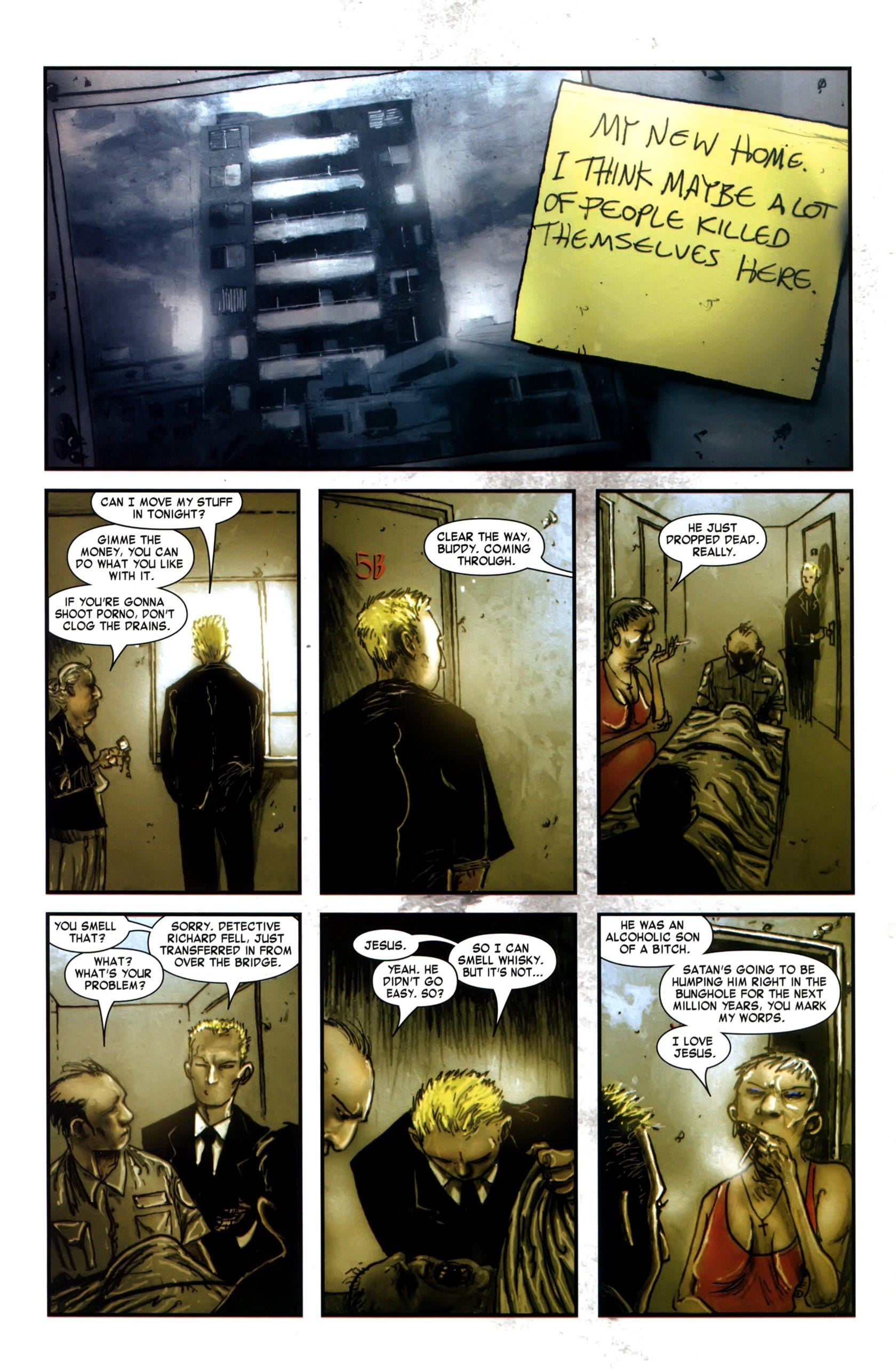
Fell #1 is an exercise in minimalism. Ellis offers almost no exposition, whether about the main characters or the setting they occupy. For all the reader knows by the end, the entire book is an exercise in metaphor (or metaphysics). The one thing that is clear is Detective Fell will be a disruptive element to whatever is at work in Snowtown. But even that is presented in very vague terms. This appeal to curiosity is what gives Fell #1 its narrative potential. The mystery works in the issue’s favor.
Templesmith’s art is also fairly minimal (though not as much as Ellis’s narrative). Characters are by far the most detailed element in Fell #1. Templesmith’s linework is more liberal with characters’ faces and many of them looked rugged and beaten down by time and experiences. Fell, here from “across the bridge” is much softer in appearance which itself speaks volumes. Particularly communicative is Templesmith’s use of color. In some cases colors communicate a given character’s space. In other instances they seem to suggest safety or danger. Fell #1 is an ideal comic for readers driven heavily by curiosity–who enjoy ambiguity and reading between the lines.
Gødland #1
(W) Joe Casey (A) Tom Scioli (C) Bill Crabtree (L) Rob Steen
Celebrating the 20th Anniversary of GODLAND, this facsimile edition reprints the first issue of this cosmic comic event! Adam Archer is Earth's star-powered champion. But what does his existence mean for the rest of humanity? And how long until the rest of the universe takes notice? Mind- altering aliens! Surreal super-villains! All-out action! The greatest heroic epic of the new age begins here!
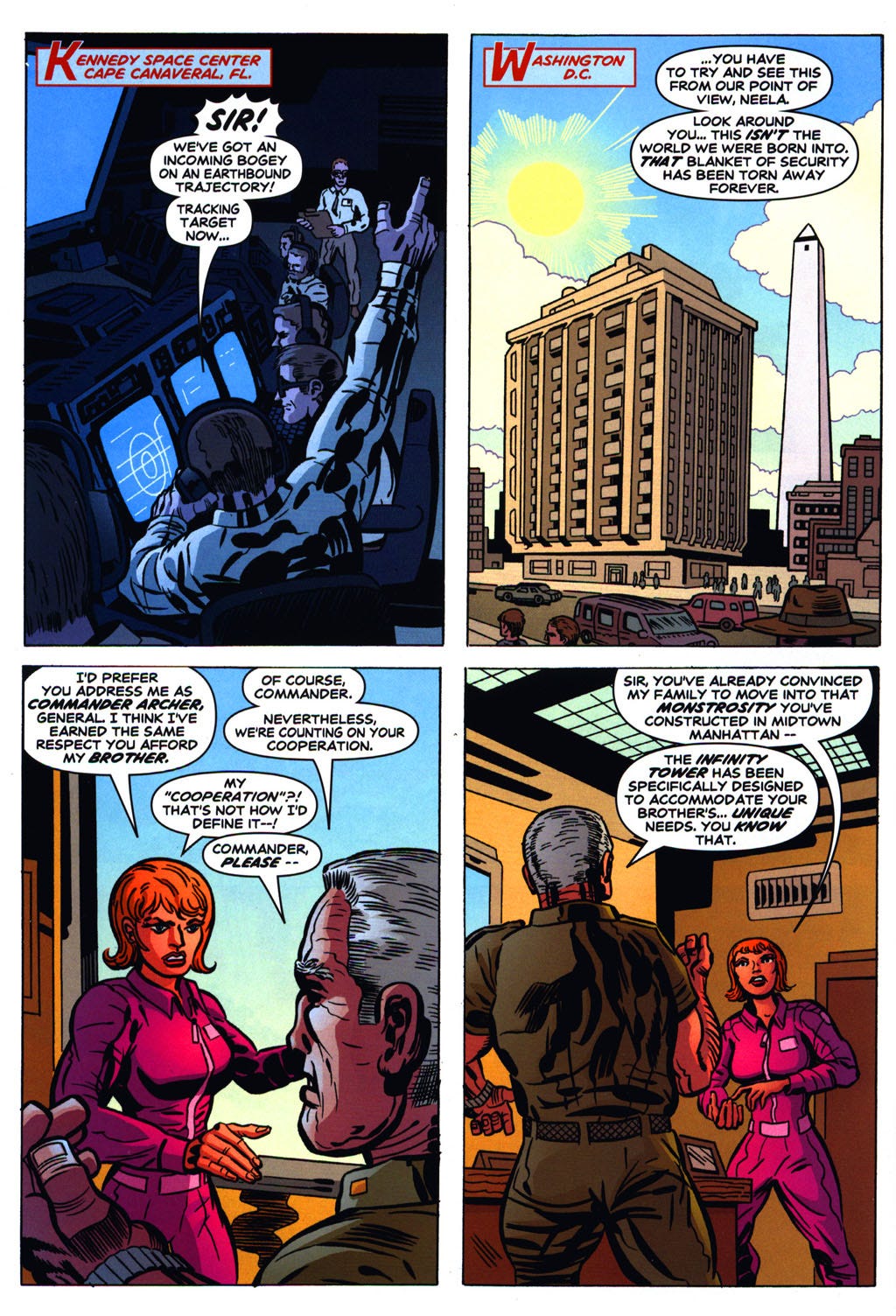
Gødland #1 offers retro cosmic fun from the first page. Casey incorporates a number of older cosmic story tropes on the way to delivering what could be a classic comic pulled off a spinner rack decades ago. The issue revolves around Adam Archer, a classic Earth hero, first as a successful astronaut and now as its super powered protector. With the two track story of Archer’s origin in flashback and an explosive encounter in the present, this issue has all the makings of a major event story.
Scioli’s art furthers Gødland #1’s classic feel. Indeed, the retro feel that Casey embraces in the overall story and the text he uses to tell it is enhanced beyond measure by the issue’s visuals. This begins with Casey and Scioli’s handling of panel count and layouts. Most pages feature a classic grid style with panels separated by white borders. With such standard layouts, the three splash pages feel like something truly special. Male characters have strong square jaws and authoritative expressions. Female characters are much softer by comparison, secondary in power based on the issue’s visuals. And Scioli uses still more classic visual tropes. Gødland #1 is definitely a niche item, but fans of retro styles and techniques will find a lot to like here.
Hunter Killer #1
(W) Mark Waid (A) Marc Silvestri; Joe B. Weems V & Eric Basaldua; Ryan Winn & Pat Aquino (C) Steve Firchow (L) Spehar & Dreamer’s Dennis Heisler
Celebrating the 20th Anniversary of HUNTER KILLER, this facsimile edition reprints the first issue of Top Cow's classic series! When the government goes too far, the highest authority steps in! Wolf and Ellis are the superpowered hunter-killers in the secret Failsafe branch of the government. Their mission: Watch the Watchmen, police the police, and fulfill the missions that are blacker than Black Ops! Fast-paced superhero action against a backdrop of lies and deception!
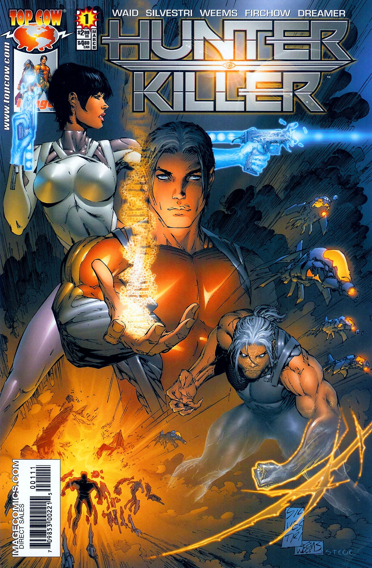
Hunter Killer #1 begins with a “previously on…” opening for readers who missed the #0 issue. While that issue doesn’t seem to be required reading for Hunter Killer #1, it’s clear from some story and character elements that having read #0 is very beneficial. Most of the issue centers around a family–two parents and an only child. Their story in Hunter Killer #1’s final pages is surprising, to the extent that some readers may find it off-putting–much of that owing to Waid’s almost ridiculously extreme dialogue. His writing is also a little clumsy early in the issue when he delivers some info-dump exposition.
Art and coloring are the better showcase of Hunter Killer #1’s potential. Silvestri’s work is typical of him. Liberal linework is used to create extensive detail both on people and settings. The opening page–a splash page closeup on a monstrous decapitated head–is gruesome. Splotches on the skin, saliva flying off the tongue, uneven flesh along the bottom of the neck–this level of detail sets the tone for the visual style to follow. Firchow’s coloring is an excellent accompaniment to Silvestri’s art, with subtle transitions and layers of different shades that add considerable depth. Waid’s overall narrative shows potential, but the true selling point of Hunter Killer #1 is its exceptional artwork.
I Hate Fairyland #1
(W & A) Skottie Young (C) Jean-Francious Beaulieu (L) Nate Piekos of Blambot
Celebrating the 10th Anniversary of I HATE FAIRYLAND, this facsimile edition reprints the first issue of the best-selling series. The Adventure Time/Alice in Wonderland-style epic that smashes it's cute little face against Tank Girl/Deadpool-esque violent madness has arrived. In an adventure that ain't for the little kiddies, (unless you have super cool parents, then whatever), you'll meet Gert-a six year old girl who has been stuck in the magical world of Fairyland for thirty years and will hack and slash her way through anything to find her way back home. Join Gert and her giant battle-axe on a delightfully blood soaked journey to see who will survive the girl who HATES FAIRYLAND!
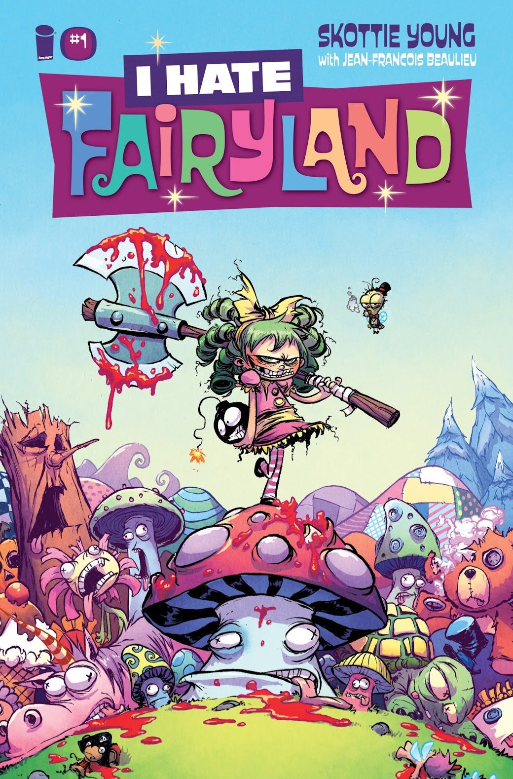
Beaulieu’s coloring runs away with the visuals in I Hate Fairyland #1. This doesn’t discount Young’s art which is detailed and perfectly captures the aesthetic many people will expect for a childhood fairytale. The coloring, though, gives the issue its life. Beaulieu favors a bright color palette which doesn’t overwhelm but does result in sharp contrast throughout the issue. Young’s best work comes in the form of Gertrude. Her overall design fits with the issue’s aesthetic, but her actions and attitude subvert that aesthetic.
I Hate Fairyland #1 is legitimately funny, likely to induce smiles and audible chuckles from most readers. Gertrude is an engaging comedic lead. That said, I Hate Fairyland #1 largely rests on the same joke over and over again. Gertrude has been lost in Fairyland for 27 years. She hates it. She takes out her frustration on all of its people and creatures as often as possible. Killing the narrating moon is particularly amusing. But narratively, the issue offers very little. A reader’s interest in following the series will depend highly on whether they think this one joke can sustain itself.

What is good, everybody?
Thanks for reading Image Comics Facsimile Fever.
If you enjoyed this review (or even hated it!)…
You can also find me on X and Bluesky where I’m very active.
Republished at Comic Watch.