


Absolute Martian Manhunter #1 Review
The Power of Color

Writer: Deniz Camp
Art & Colors: Javier Rodriguez
Letters: Hassan Otsmane-Elhaou
Cover: Javier Rodriguez
Variant Covers: Guillem March; Marcos Martin; Rafael Albuquerque
Publisher: DC Comics
Price: 4.99
Release Date: March 26, 2025
In Living Color
Involving or containing a random variable. That’s one way to define “stochastic,” an idea that is central to Absolute Martian Manhunter #1. Do the differences in people’s lives boil down to nothing more than randomness? Maybe. Maybe not. What is important, though, is that the journey to find that out takes place in one of the most color oriented comic books released in a long time.
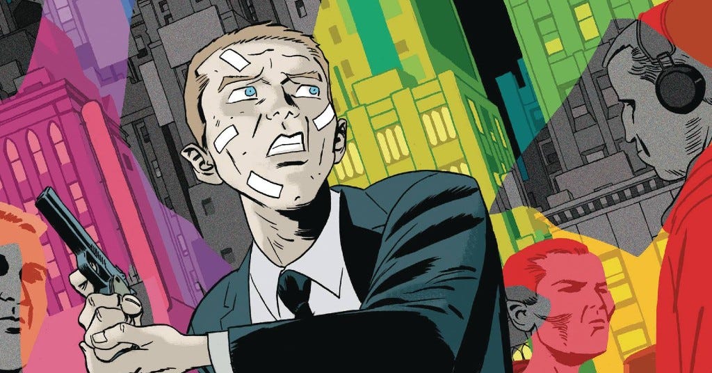
Agent John Jones works for the Stochastic Terrorism Task Force, and he’s just coming off an injury in Absolute Martian Manhunter #1. His superior wants him to take time off. John refuses. He’s become more and more obsessed with discovering what makes people different–how one change can make a difference in two otherwise identical lives. And in the process of struggling with this idea, John starts seeing smoke. Lots of smoke. Colorful smoke. Whole people who are smoking. And he has no idea what to make of it.
Comic book coloring is usually a facet of an issue’s construction–one of several creative components that help tell the story in any given issue. In some cases, coloring steals the show visually. Less common, though, is color being a part of the narrative–of telling the story from an in-universe point of view.
John spends most of Absolute Martian Manhunter #1 in a quest to understand why people do what they do. Certainly that’s a key part of being on the FBI’s stochastic task force. Camp explores that in a relatively straightforward way via John’s internal monologue. John’s consideration of the topic does border on obsession, but that plays into his job so it’s not necessarily a character flaw.
The greater examination of “why do people do what they do” comes from Rodroguez’s art, primarily his coloring. The story sees John finding answers in interaction with smoke that radiates from seemingly everyone. It’s unknown how much a general color palette may or may not have been influenced specifically by Absolute Martian Manhunter #1’s script. But in any event, Rodriguez creates a world that starts out relatively static before growing into a psychedelic experience surrounding a still mostly plain John. John is interacting with and learning from a world that he is less and less part of.
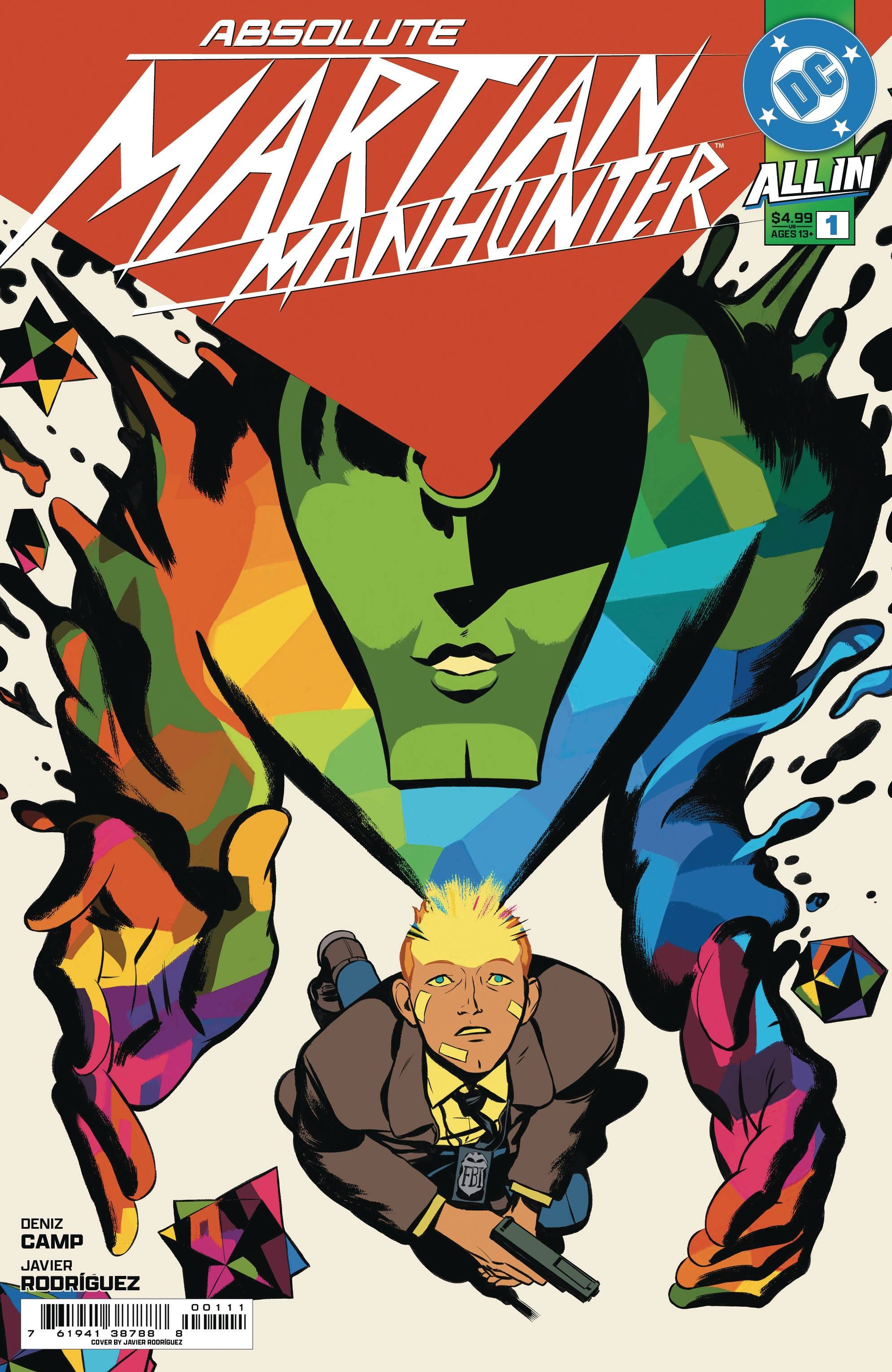
That said, Camp and Rodriguez repeatedly hint that there is something at work within John by tying him to a red dot that repeatedly appears within a green field (sometimes that color orientation will itself also appear in heavy contrast against other undefined bright colors). Absolute Martian Manhuunter #1’s cover somewhat gives away where this color scheme and its relationship to John is going. Nevertheless, it’s an intriguing way to keep him separate from the colorful world around him.
Talking to Himself?
Camp gives John an internal monologue that is absolutely essential. While it’s true that the more captivating part of the issue is how Rodriguez tells the story visually, without Camp’s guiding text it would be easy to get lost. Crucially, Camp balances the text necessary to understand John and advance his story with the art that makes the issue something special.
Divorced from his intense coloring in Absolute Martian Manhunter #1, Rodriguez’s art is compelling in the way it depicts a largely ordinary setting populated by largely ordinary characters. They are lean for the most part. Most are expressive in close-ups, especially John. Until the vivid and undefined coloring takes over as the driving visual force, Rodriguez presents John in an almost mudande fashion. This makes the transformation into what the issue becomes all the more striking.
John effectively has three internal conversations in Absolute Martian Manhunter #1. The first is a standard internal monologue. Otsmane-Elhaou uses the same font as is used for the issue’s dialogue, a “standard” font. From time to time John has what amounts to an aside within his own personal narrative. This font is smaller and a mix of upper and lower case letters. Finally there is dialogue that seems to come from outside John while simultaneously relating to him internally–referring to him as a kind of “martian.” This text is akin to an older print out computer font. The three font choices very effectively reflect the struggle that John is experiencing in himself even as he is surrounded by his growing sense of what is at work within others.
Final Thoughts
Even when it’s critical to a comic, coloring is often seen as secondary in an issue’s art. Sometimes it is undeservedly disregarded altogether. Absolute Martian Manhunter #1 turns that kind of thinking on its head by delivering a comic book not just driven by but reliant on the rich, varied, and complex coloring at work here. John’s examination couldn’t be experienced in the same way without this kind of artistic journey. Even if the story wasn’t compelling enough to make the issue a “can’t miss” (it is), Absolute Martian Manhunter #1 is an art and color experience that’s a “must have.”
What is good, everybody?
Thanks for reading the review of DC Comics’ Absolute Martian Manhunter #1.
If you enjoyed this review (or even hated it!)…
You can also find me on X and Bluesky where I’m very active.
Also published at Comic Watch.